HESCA Corporate Brand Film
A two-minute corporate film produced by Focus Media for HESCA, complementing the brand identity, website and marketing visuals.
Watch the complete film on YouTube

Brand identity · Trilingual website · Corporate film
Building on HESCA’s logo, collateral and corporate film, Focus Media completed a new trilingual website design. The green identity remains within a light, gold-accented page system, giving English, Simplified Chinese and Traditional Chinese audiences a consistent way to explore the business.
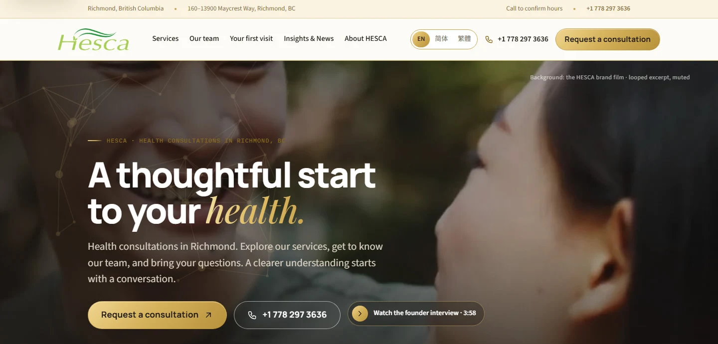
THE REDESIGN · THREE LANGUAGES
Simplified Chinese, Traditional Chinese and English share one visual and content system. Choose a language to explore the homepage and selected inner pages. Open any image for a closer look.
Completed trilingual website redesign · Selected design excerpts
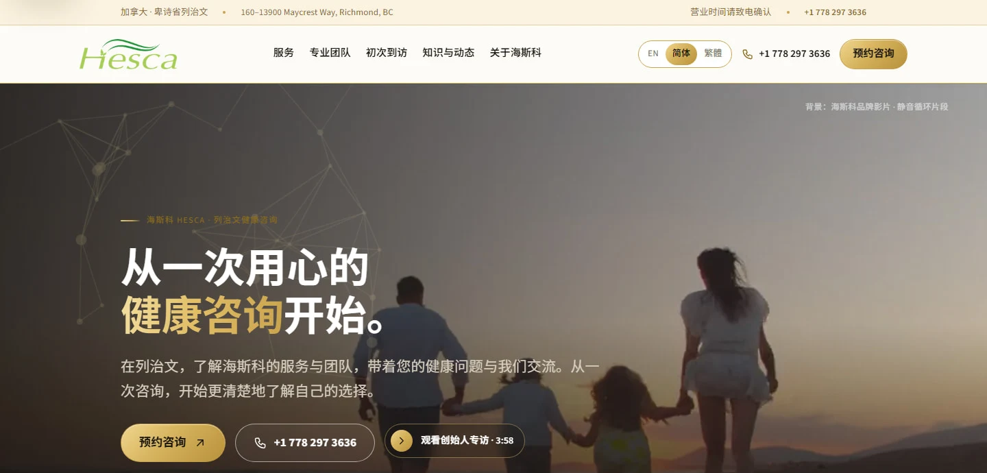
The green identity remains, gold accents highlight the next step, and the existing brand film becomes part of the opening experience.
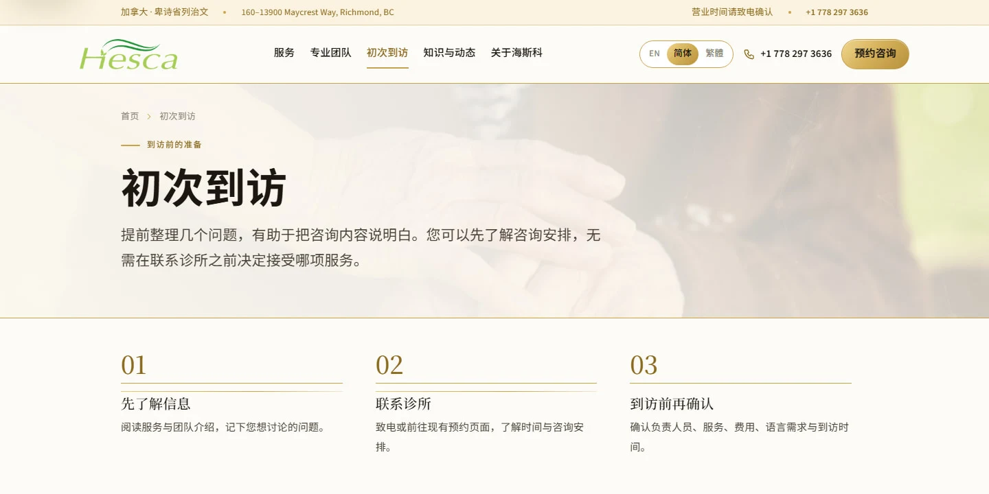
Explore the information, contact the clinic, then confirm the arrangements. A simple sequence prepares visitors for the next conversation.
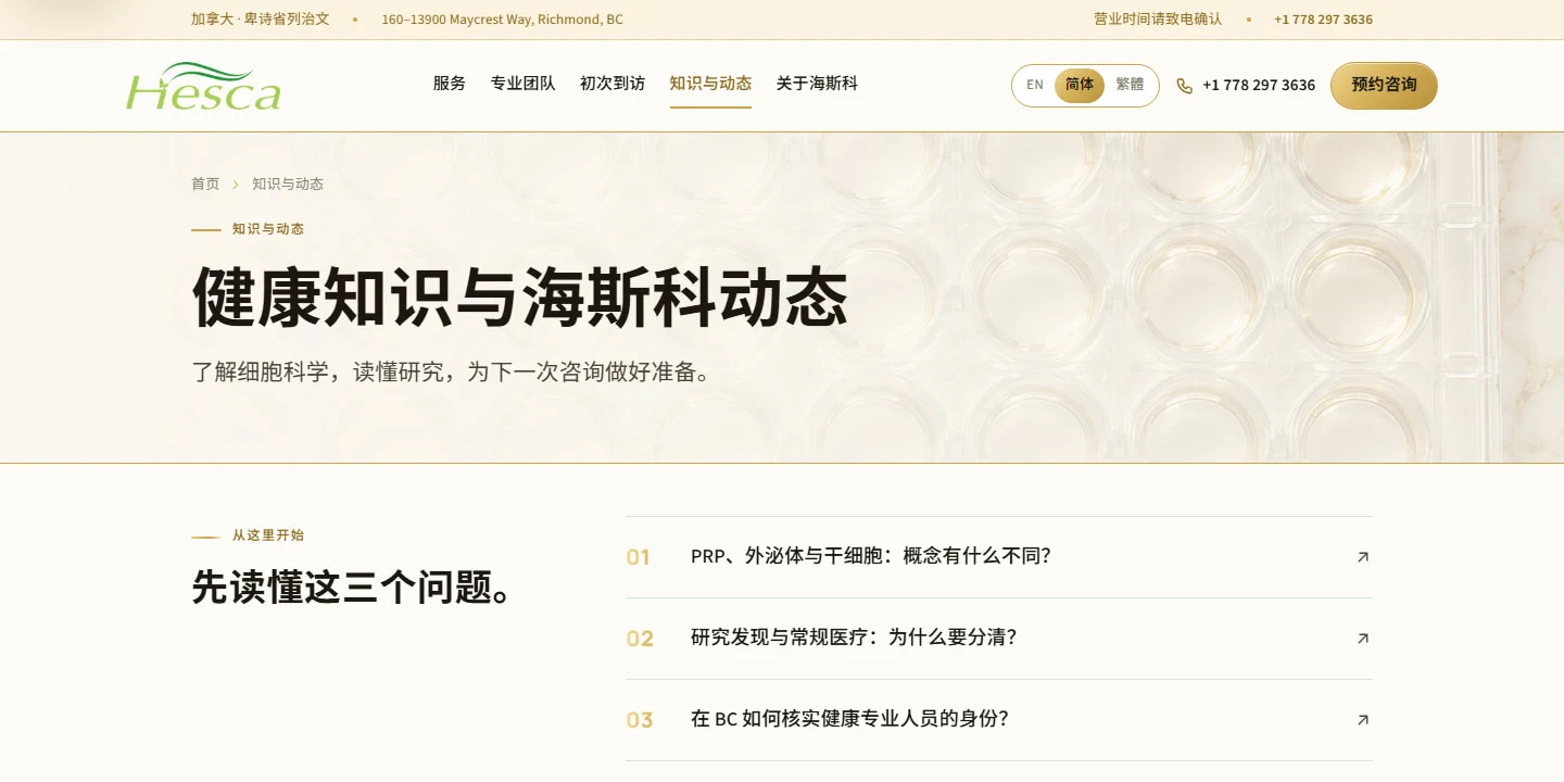
Visitor questions lead into distinct sections for visit guidance, science and company news—a structure ready for future content updates.
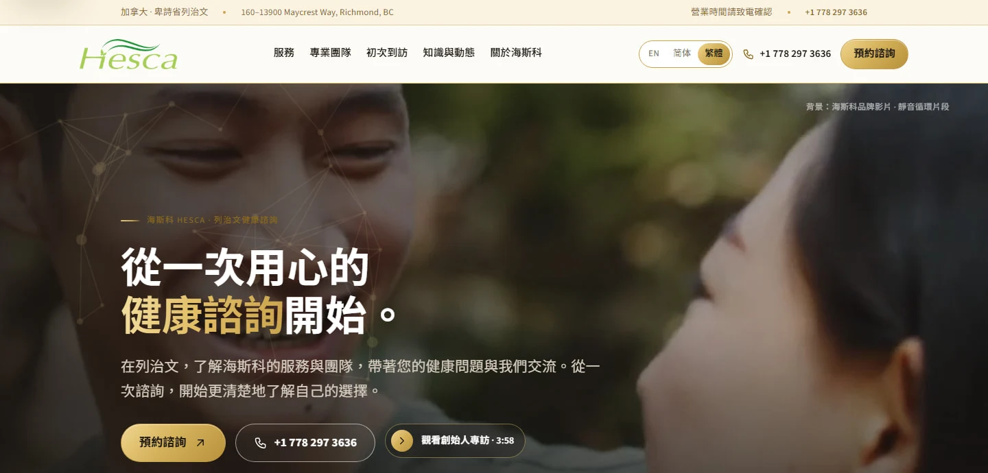
The green identity remains, gold accents highlight the next step, and the existing brand film becomes part of the opening experience.
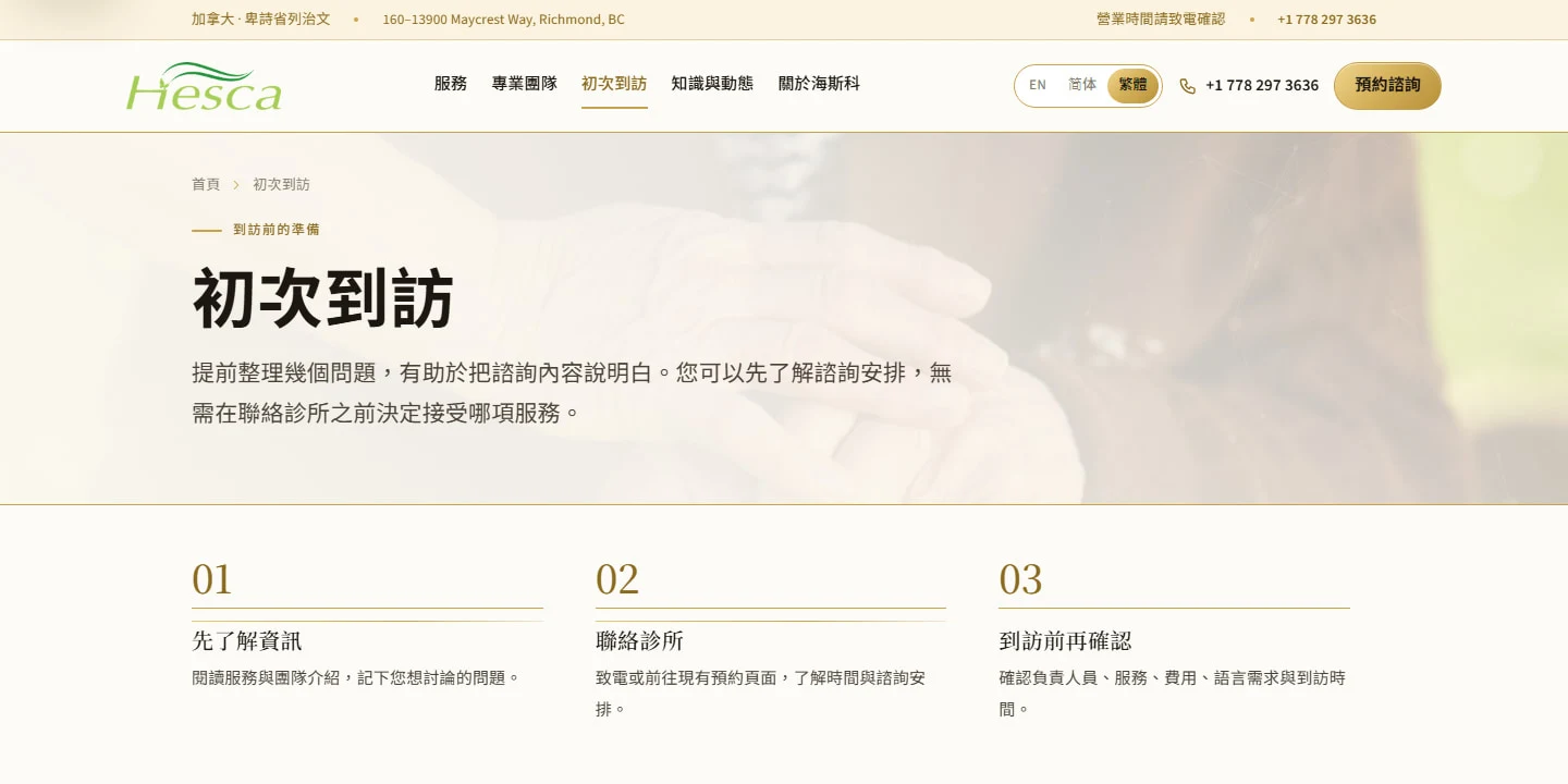
Explore the information, contact the clinic, then confirm the arrangements. A simple sequence prepares visitors for the next conversation.
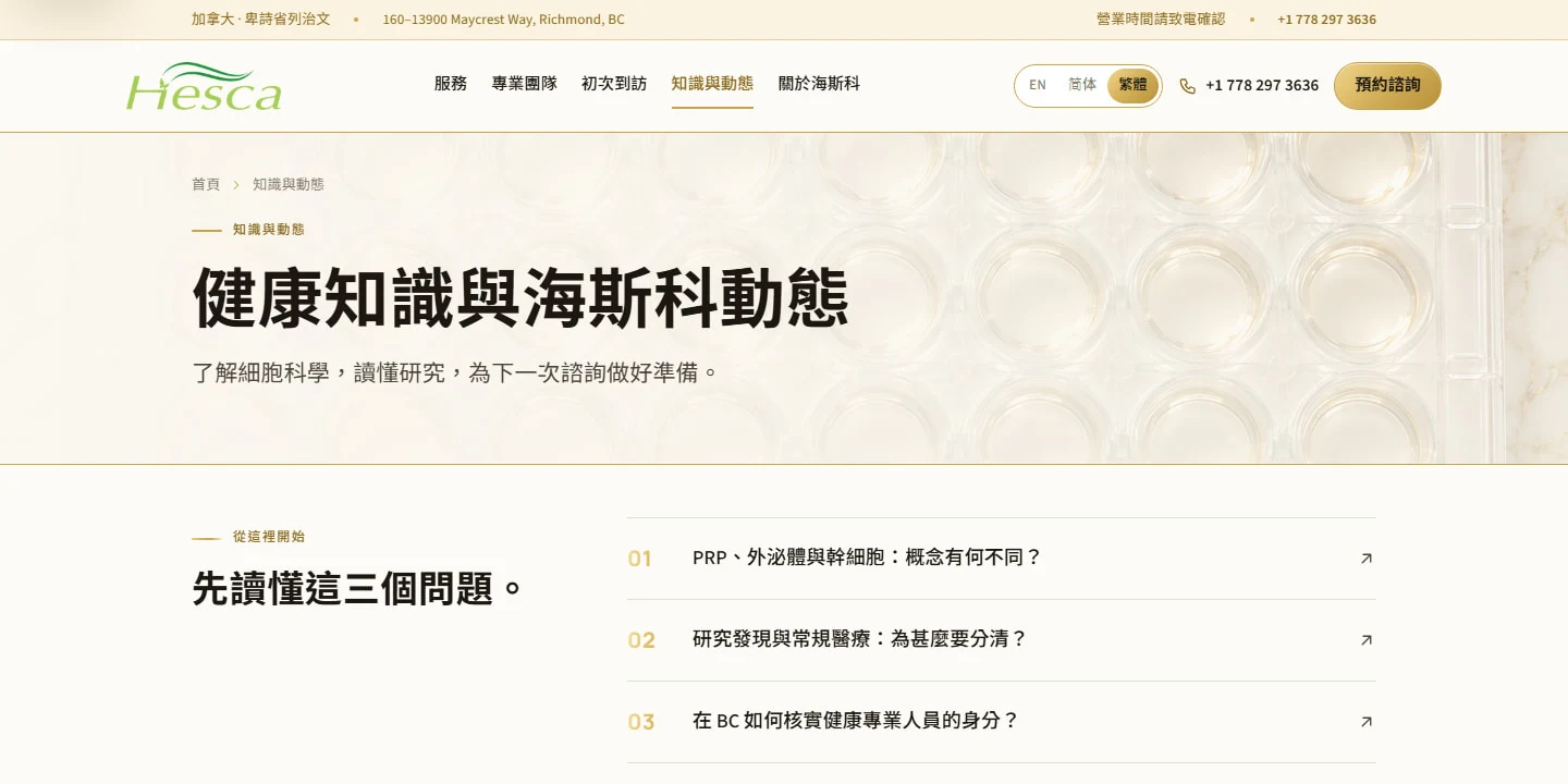
Visitor questions lead into distinct sections for visit guidance, science and company news—a structure ready for future content updates.
The green identity remains, gold accents highlight the next step, and the existing brand film becomes part of the opening experience.
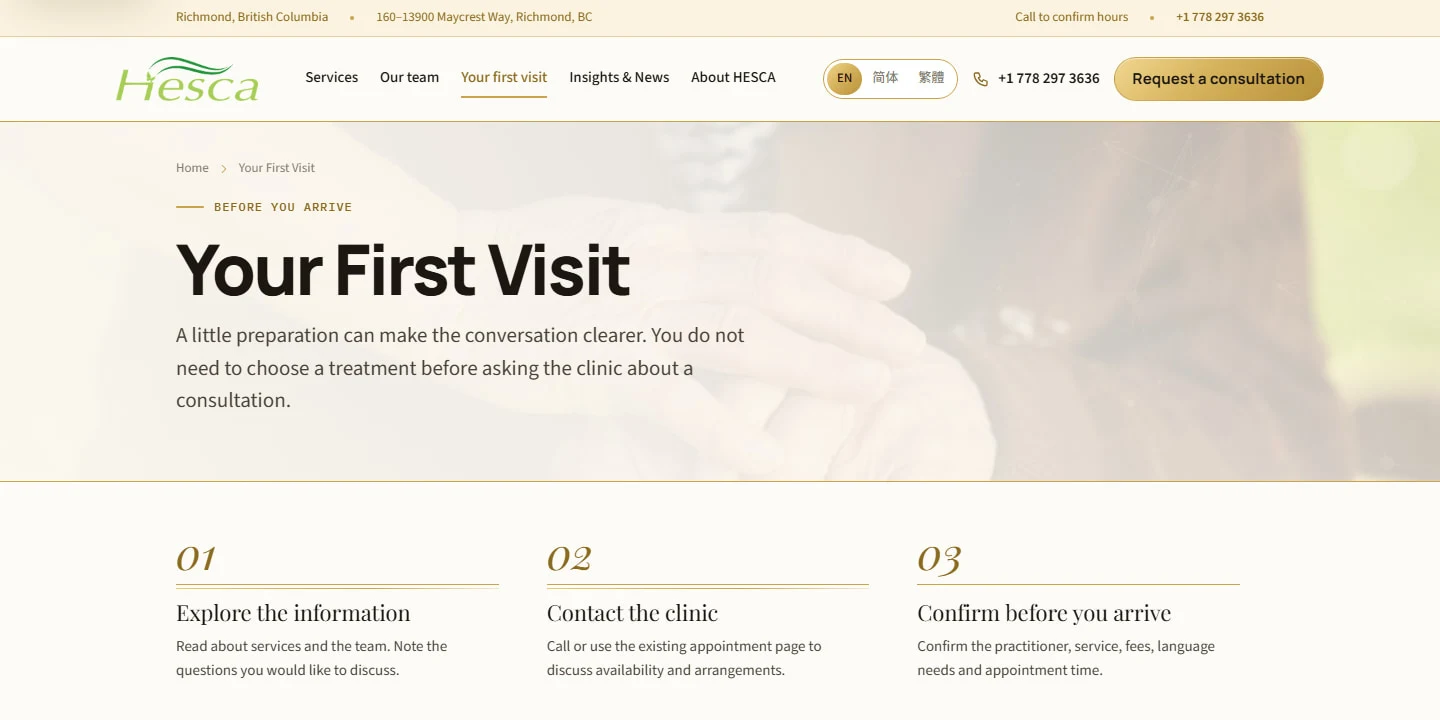
Explore the information, contact the clinic, then confirm the arrangements. A simple sequence prepares visitors for the next conversation.
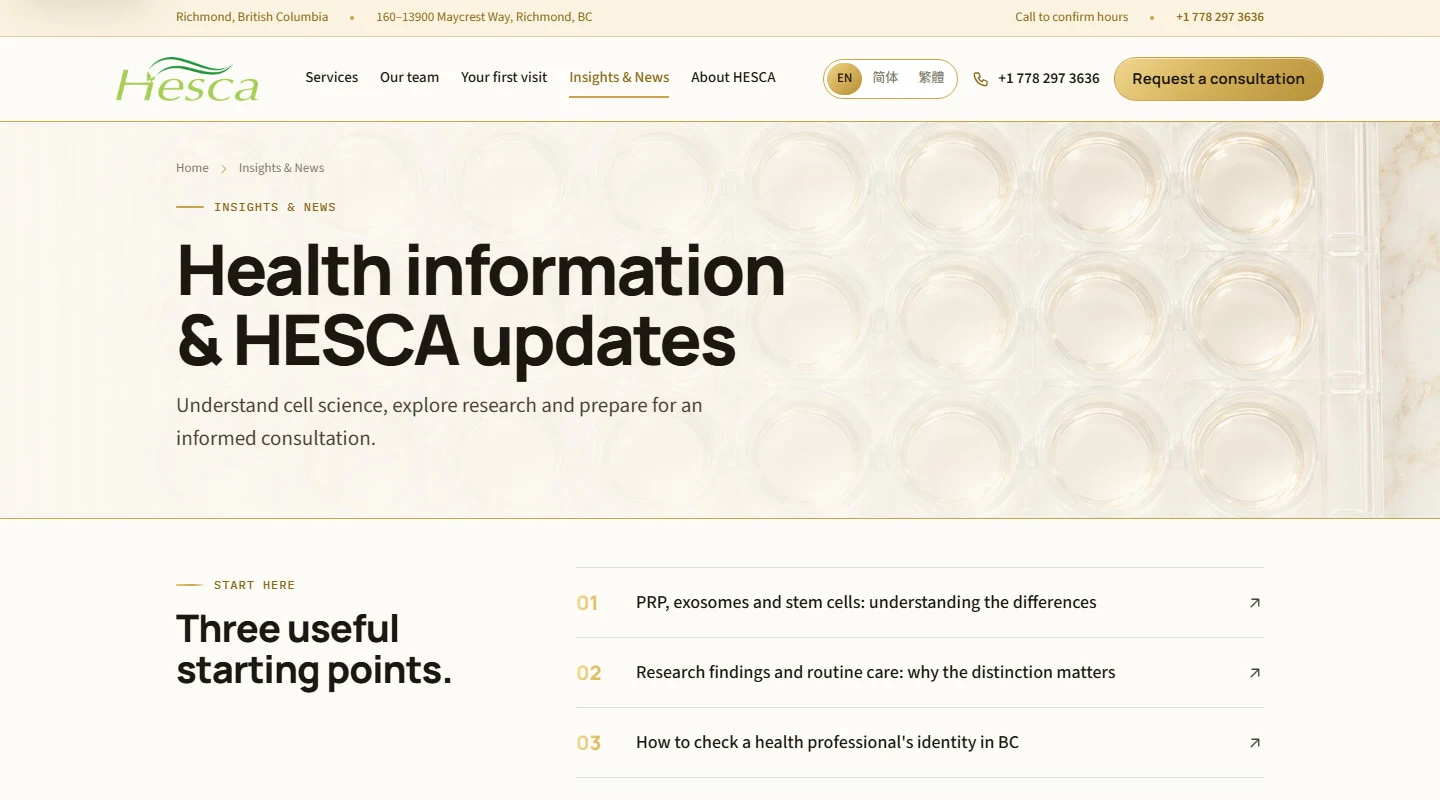
Visitor questions lead into distinct sections for visit guidance, science and company news—a structure ready for future content updates.
People shown in the homepage imagery come from the brand film or licensed material; they do not represent HESCA patients or clinic staff.
VISUALS CREATED FOR THIS BRAND
Translucent forms, gold detail and warm-white backgrounds connect these illustrations to the website. They are concept visuals, not microscope photographs or demonstrations of treatment outcomes.
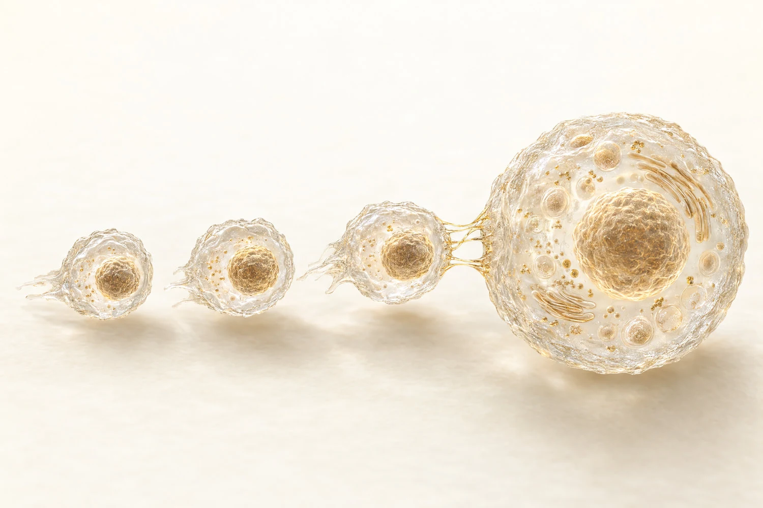
Translucent forms and gold details bring a microscopic theme into the brand’s visual language.
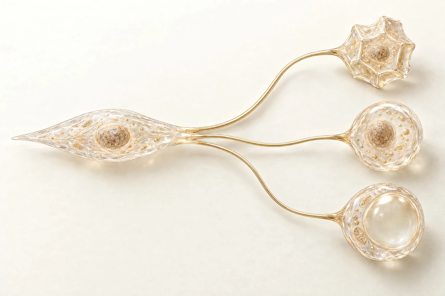
A branching composition and generous space create a clear visual hierarchy for a complex subject.

Changes in scale and spacing create a light, ordered, science-inspired composition.
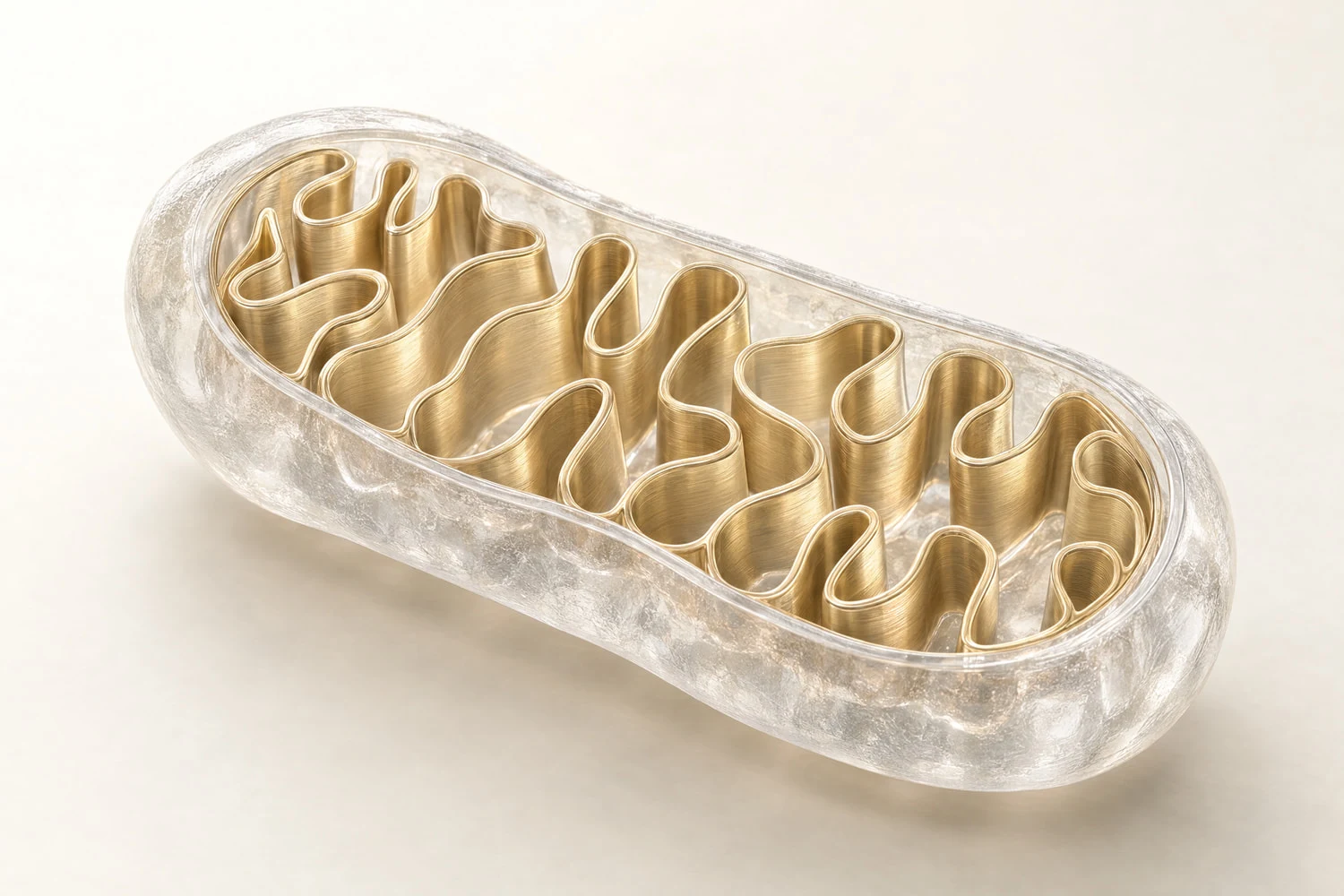
Warm whites and gold carry the same design language from the website into each illustration.
The completed design and film provide brand assets for the next phase. The wider marketing rollout is not yet fully underway.
Continue to the HESCA corporate film ↓Selected Focus Media work
From visual identity to film, Focus Media brings HESCA’s website and promotional content together. Watch the complete corporate film.
Explore the Upperland Studio production archiveA two-minute corporate film produced by Focus Media for HESCA, complementing the brand identity, website and marketing visuals.
Watch the complete film on YouTubeProject context
HESCA’s website brings together business information, services, visit guidance and educational content. The redesign organises these around a clear reading journey, with corresponding structures across English, Simplified Chinese and Traditional Chinese.
Delivered by Focus Media
How the work creates value
The green logo preserves HESCA’s established identity, while gold accents and light backgrounds define the new page system. The homepage introduces the business and guides visitors to services, visit information and educational content. The same structure carries across all three languages, with existing collateral and film providing a content foundation for the wider rollout.
Real work and delivery capability
The logo and earlier website show HESCA’s original visual identity. The redesign retains the green wordmark within a new page system, alongside the existing collateral and corporate film.
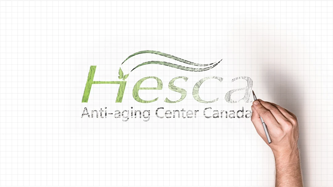
The green wordmark and flowing lines establish the visual identity. The drawing-style presentation highlights the logo’s lines and brand colour.
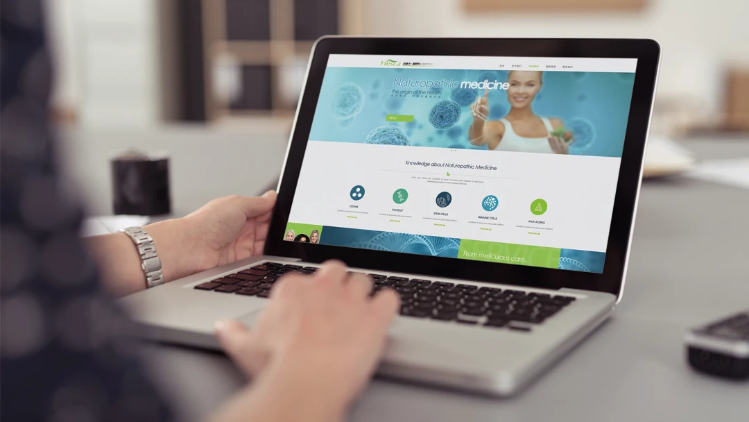
The earlier website mockup shows how the logo, green hero design and content sections first came together. The new website design builds on that identity with a revised visual and information structure across three languages.
Explore earlier websiteMore Focus Media work
Current updates and related insights
Explore recent films, project updates and ideas for your own business marketing.
FAQ
We designed HESCA’s logo, business website and promotional collateral, and produced its corporate film. This update presents the completed trilingual website design alongside the earlier brand and marketing work.
English, Simplified Chinese and Traditional Chinese share corresponding page structures, heading levels and navigation. The green logo preserves recognition, while gold accents and light layouts provide a consistent visual hierarchy for each language.
The new website design is complete; the wider integrated marketing rollout is not yet fully underway. This case presents the website design alongside the existing logo, collateral and film.
Start a project like this
Tell Focus Media about your positioning, audience and next-stage plans. Together, we can define the priorities for your brand, website and content.
Free AI Customer Acquisition Assessment Cute Seal Website and Brand Films
 Artemis healthcare website and AI reception
 Healthcare websites and search systems